You’ve probably seen this chart before. It’s everywhere now. I’ve used it more than a few times over the years. It’s the chart from the Economic Policy Institute that shows that while US productivity has continued to increased over the last few decades, real inflation-adjusted wages haven’t kept pace:

I’ve seen two bad misreadings of this chart lately, and I want to clear them up.
First, there’s the right-wing reply to this chart. If you show it to folks on the right, they’ll claim that hourly compensation is a misleading statistic because it doesn’t include non-wage employee benefits. The conservative Heritage Foundation claims that once you include these other benefits the gap becomes much smaller and therefore everything is fine:

What they don’t tell you is that most of the “benefits” which Heritage include under compensation don’t actually put any more disposable income in workers’ pockets. Most of the difference between the Heritage version and the EPI version is that Heritage counts the cost of health insurance as part of compensation. Health insurance premiums have increased much faster than wages:

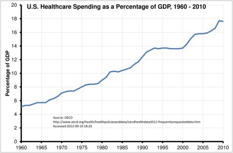
Indeed, health care spending as a percent of GDP has more than doubled since the early 70s:
Heritage’s graph doesn’t show that American wages have been keeping up with productivity–instead it shows that the healthcare sector has confiscated much of our wage increases since the 70s. Other countries have seen some increase (mostly due to ageing populations), but theirs pale in comparison to ours:

Perhaps, on reflection, we’d decide that we’d be happy to use much of our increasing output to create jobs in the healthcare sector. But we haven’t been able to make that choice because we don’t have a single payer system which enables us to collectively determine the size of the sector. Instead the healthcare sector uses the inherent leverage it possesses to forcibly increase its size. Patients, who need healthcare to live, have relatively little leverage in the small groups which multipayer systems inevitably create. They’d have much greater leverage if the state could negotiate on behalf of the entire patient pool.
So we have to thank Heritage, because they’ve helped us see an important connection in the American case between wage stagnation and the healthcare debate, even if it’s not what they intended to do.
The second misreading comes–bizarrely–from popular socialist pages on social media. They seem to believe that the EPI chart illustrates Karl Marx’s theory of exploitation. See the emoji version of Marx, lurking in the background of this post from Jeb2020, a Facebook page premised on the notion that it would be funny if Jeb Bush were a secret communist:

You can see why they might make this mistake. The theory of exploitation claims that workers do not receive full compensation for the value of their labor, and it’s true that when productivity increases faster than wages, the amount of exploitation (in the Marxist sense of that term) increases. But the chart does not straightforwardly illustrate exploitation because prior to the 70s it shows the two more or less in lockstep. This would imply that there was little or no exploitation in the Marxist sense during the 40s, 50s, 60s. But of course the US in the post-war period wasn’t under full socialism. American workers in 1950 didn’t receive the full value of their productivity. What the chart shows is that the exploitative relationships of post-war American capitalism slightly improved for a generation before worsening considerably. To get a real sense for the level of Marxist exploitation in America, the chart would have to remove the indexing which fixes the relationship between employers and employees in 1947 as the baseline. If we did that, we would see that there has always been a gap between productivity and wages, but the gap did not increase in real terms (and it fell as a percentage) in the post-war period, rising thereafter.
This might seem like a trivial distinction, but it’s important–some Marxists think that exploitation inevitably increases in severity under capitalism, but the post-war period shows a level of exploitation that is steady in absolute terms and declining in relative terms. This possibility was not anticipated by Marx or by many of his early and mid 20th century successors. This doesn’t necessarily mean Marxism is bogus, but it does mean that Marxists need to have a plausible theory of this period. They need to be able to explain how and why it happened. Marx expected capitalism to produce endless concentration of capital and endless worker misery until the whole thing collapsed, but the post-war period saw shrinking inequality and living standard increases for ordinary people. Capitalism may still exhaust itself as an economic model–perhaps by pushing us toward ever greater levels of automation. But if capitalism’s exhaustion is mechanistically different from Marx’s model, this will likely change what follows and how we get there, too. It made a lot of sense to expect the trade unions to be the backbone of the left when Marxists believed that the disgruntled industrial workers of the 30s would lead us into the socialist dawn. Many of those unions did accomplish a lot–they played a pivotal role in restraining and reversing the level of exploitation in the post-war period. But in a world where globalization and automation are gutting the negotiating power of labor and the industrial working class has mostly been obliterated in the west, those trade unions probably won’t be able to play that kind of role anymore. In such a world, union weakness would not merely be a result of state policy–it would be a structural consequence of a vastly expanded global labor market and vastly expanded technological alternatives. When the world is full of robot scabs the strike loses its lustre. Marxists can’t pretend that Marx could foresee all of this anymore–it’s plain that he could not. The left has to adapt to these structural changes in the material features of capitalism.
